A mobile laboratory - LAB

A mobile laboratory traveling
around the world to inspire
innovative ideas for urban life
BMW Guggenheim Lab
Send to a Friend | Subscribe to E-news | Unsubscribe | Privacy Policy
Open through October 16, 2011, First Park | Houston at 2nd Avenue, A New York City Parks property.
Visit us online at bmwguggenheimlab.org.

Bernhard Heiliger Award for sculpture goes to Argentina-born artist Fabián Marcaccio

Bernhard Heiliger Award for sculpture goes to Argentina-born artist Fabián Marcaccio

Fabián Marcaccio, CNN-Paintant, 2009. Pigmentierte Tinte auf Leinwand, Aluminium, Silikon, Alkydfarbe,

20 x 183 x 127 cm.
Courtesy: Galerie Thomas Schulte, Berlin.
  
BERLIN.- In 2011, the fourth Bernhard Heiliger Award for Sculpture honors the Argentina-born artist Fabián Marcaccio.
The award ceremony will be held on September 10, 2011, at the Berlin Academy of Arts at Pariser Platz.
The solo exhibition on that occasion at Berlin Georg Kolbe Museum opens September
11 and runs until November 20, 2011. The exhibition will also be shown at LehmbruckMuseum
Duisburg from March 15 to June 10, 2012.

Created in 1999, the Bernhard Heiliger Award for Sculpture is endowed with 15,000 EUR and is awarded by an
 independent jury. Jurors of this year's jury were Udo Kittelmann, director of the National Gallery in Berlin,
Prof. Dr. Raimund Stecker, director of the LehmbruckMuseum in Duisburg, and Dr. Anda Rottenberg,
independent curator and former director of the National Gallery Zachęta for Contemporary Art in Warsaw.
The intention of this prize is the appreciation of a sculptural oeuvre with intrinsic significance irrespective of
  art-market fashions, which has contributed considerably to sculpture or to the perception of sculpture as
an art form. Previous winners were Bertrand Lavier (1999), Fritz Schwegler (2003) and Antony Gormley (2007).

Fabián Marcaccio, born in 1963 in Rosario de Santa Fe in Argentina, has lived and worked in New York for more
 than 20 years. Since the early 1990s, Fabián Marcaccio occupies himself with the examination and extension of the
classical concept of painting. His "Paintants"—a neologism of the words "mutant" and "paintings"—merge the concepts
of painting, sculpture and object art. In Germany, his renown is based mainly on individual exhibitions at the
Württembergischer Kunstverein Stuttgart (2000) and the Kölnischer Kunstverein (2001) as well as on his participation
in Documenta XI (2002). In recent times, the ever-increasing plasticity apparent in his works coalesced into large-scale
  figurative tableaus, "The Structural Canvas Paintants", whose sculptural quality was highlighted by the jury thoroughly.
 In this new series, Marcaccio takes on contemporary issues in politics, economy and society. These include globalization,
 the banking crisis, trans-sexuality, genetic engineering and terrorism as well as the role of the media. Akin to a three
dimensional modern history painting, Marcaccio narrates current events or recent historical moments, prompting
 his viewers to question their truthfulness at the same time.

The award ceremony and the exhibition at Georg Kolbe Museum is accompanied by a bilingual (German/English)
 publication with texts be Raimund Stecker and Marc Wellmann, edited by the Bernhard Heiliger Foundation.
The entire project is made possible through the generous support of the Stiftung Deutsche Klassenlotterie Berlin.
 
Courtesy: ArtDaily

Iraq's holiest Shiite city, Najaf, will become an Islamic Capital of Culture next year

Thursday, March 17, 2011
PRASHANT RAO
NAJAF - Agence France-Presse
Iraq's holiest Shiite city, Najaf, will become an Islamic Capital of Culture next year. The Najaf celebrations are part of broad efforts by Iraqi authorities to put the country back on the cultural map after the US-led invasion of 2003 to oust Saddam Hussein led to years of brutal sectarian war. Preparations, however, are running well-behind schedule
In 2009 the culture ministers of Muslim countries chose Najaf as one of three Islamic cultural capitals in 2012 along with Dhaka for Asia and Niamey for Africa.

In 2009 the culture ministers of Muslim countries chose Najaf as one of three Islamic cultural capitals in 2012 along with Dhaka for Asia and Niamey for Africa.


A half-billion-dollar effort to showcase Iraq's holiest Shiite city to the world is coming down to the wire as many contracts remain unsigned and funds are hastily being reallocated.
Preparations for Najaf to become the Arab world's Islamic Capital of Culture next year are under way, but officials involved in its planning admit that time is short and much remains to be done.
"We don't have enough time, we need more time," said Nizar Hussein al-Naffakh, a Najaf provincial council member and one of the event's organizers.
"We only started work at the end of last year and Najaf will become the Islamic capital of culture from Jan. 1, 2012. There are real obstacles but we hope to overcome them in order to show our city in the most positive light," he said.
The Najaf celebrations are part of broad efforts by Iraqi authorities to put the country back on the cultural map, after the U.S.-led invasion of 2003 to oust Saddam Hussein led to years of brutal sectarian war.
Iraq is due to host an Arab League summit, initially scheduled for March 29 but now delayed until the end of May due to regional unrest.
Football's Gulf Cup is also to be held in the southern port of Basra in 2013, the same year that Baghdad becomes the Arab capital of culture.
"These kinds of events, they are like the Olympic Games," said Amman-based UNESCO cultural expert Tamara Teneishvili.
"They always contribute to the development of infrastructure and they provide wide international exposure. This is very important," she said.
In 2009 the culture ministers of Muslim countries chose Najaf as one of three Islamic cultural capitals in 2012 along with Dhaka for Asia and Niamey for Africa.
The year-long festivities include conferences covering topics ranging from the legacy of Imam Ali, to whom a major shrine is dedicated in the city, to modern-day Islamophobia.
Imam Ali, a seventh-century Islamic leader who was a cousin and son-in-law of the Prophet Mohammed, is revered among Shiite Muslims as the first imam of the Shiite order, as well as being a military leader and writer.
Authorities are also planning to translate 200 works of Islamic literature into English and French, as well as host recitals of traditional Islamic music, though there will be no dance performances.
The overall budget for the Najaf ceremonies, including capital investment and cultural activities, is 537 billion Iraqi dinars ($455 million).
But of more than 70 projects that have been planned to get Najaf ready – ranging from a $100-million cultural complex to new waste treatment facilities – a fifth have not yet been assigned to contractors.
The cultural complex, comprised of a 44,000-square meter building and 115,000 square meters (1.24 million square feet) of landscape, is on time, said Turkish site supervisor Oğuz Düzen.

Its roof is due to be completed by mid-May, when the number of workers on the project will quadruple to 600 and operations run around the clock to complete the "cultural city," a single building that includes a 1,500-seat conference hall and a 750-seat theater as well as a library and a museum.
According to Aqeel al-Mindalawi, an Iraqi Culture Ministry official who is part of the 10-member committee responsible for organizing the Najaf 2012 celebrations, the complex will be handed over at the end of the year.
But he admits that a contingency planning is under way in case it is not.
"If the cultural city is not ready by the end of the year, we will set up a temporary site in the Sea of Najaf," he says, referring to a swathe of agricultural land that abuts the holy city.
"We have alternative plans, but we are still optimistic."

Several other projects designed to upgrade Najaf's infrastructure and that of twin city Kufa, however, will either not be ready for the start of next year or are slated to be completed just before the ceremonies begin.
Of two major highways being constructed, one will be finished at the end of this year while the other will be ready in early 2012. Plans to upgrade Najaf's roads have been slowed by delayed improvements to the city's sewage system, according to Mindalawi.

He blames a combination of Saddam-era administrative regulations and new rules that require a public call for bids for projects, both of which he said took too much time.

Further complicating matters is the sudden prospect of local elections this year, with delays to the formation of a national government following March 2010 elections having already set back the Najaf planning.
In response to massive nationwide protests railing against corruption, poor public services and unemployment, Prime Minister Nuri al-Maliki has backed early provincial polls for this year.

An ambitious $170 million cultural program has also been scaled back as money has had to be diverted to capital investment to upgrade the city's infrastructure and hotels.
In particular, funds have been redirected to build a five-star hotel after private investors pulled out of plans to build two such facilities in the city.
Indeed, one of the mooted benefits of the Najaf festivities – increased tourism – is limited by the lack of spare hotel capacity.

Among Najaf's 170-odd hotels and hostels is just one four-star facility, with overall city-wide capacity barely able to accommodate the thousands of Shiite pilgrims, mostly Iranian, visiting on a daily basis, principally to see the Imam Ali shrine.

The Najaf Chamber of Commerce expects 100,000 more tourists to visit the city for the 2012 ceremonies and notes few new hotels will be ready in time to accommodate the flow.
Officials are drawing up contingency plans, including one to ferry VIPs from up-scale hotels in Baghdad on day trips to Najaf, 150 kilometers south.
"There are several back-up plans," Mindalawi said, chuckling. "We have to – in Iraq, we have to."

Acrylic Brands and Types for Artists.

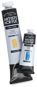
1.Acrylic Paints: Winsor & Newton Artist's Acrylics
W&N launched this range of acrylics in January 2009 to replace their Finity series. It is indeed a different product, having a longer working time (up to half an hour), minimal shift from wet to dry (because of a new binder), and a satin finish (rather than gloss). The tube labels have a painted color swatch rather than a printed one. 10 Finity colors have been discontinued and 17 new colors introduced.

I've found the longer working time removes the rush to blend colors before they dry, but isn't so long I'm twiddling my thumbs waiting for paint to dry (except on small-size paintings). The colors are rich, intense, and saturated, with a soft butter consistency that holds brushmarks.

Unrivalled in brilliance, Winsor & Newton’s new line of Artists’ Acrylics combines a revolutionary transparent binder that eliminates color shift from wet to dry with the highest-quality, maximum-strength pigments to ensure clean, strong colors with wonderful working properties.
Brilliance, defined as the richness, intensity and depth of a color, is possibly the most important quality of an acrylic paint. Consequently, in the development of Artists' Acrylics, Winsor & Newton combined its world-beating color-making experience to ensure an unrivalled brilliance and depth of color in the range. Brilliance does not mean the colors are garish. Rather, it pertains to clarity and purity of color, which should be evident when the color is applied straight from the tube as well as in the thinnest of films. Even the earths, blacks, and whites are clean and not dull.
Only the purest pigments are used in Artists' Acrylics, formulated individually to ensure the the cleanest, brightest, and strongest colors to give a wider choice and better color-mixing capabilities. Each individual formulation uses the maximum amount of pigment possible — without extenders — to produce a brilliant color with the broadest handling properties. 

Until now acrylic paints have tended to darken in tone as they dry, making color-matching difficult from wet palette to dry canvas. Color shift is due to the binder changing from white to transparent as it dries. As the white emulsion dries within the color and becomes clear, the paint becomes more transparent and therefore darker.
Winsor & Newton’s expertise in color-making and resin technology has resulted in a unique binder that is translucent when wet and dries clear — ensuring virtually no shift in color, and colors that remain as brilliant when dry as they are when wet. The result is a range that allows artists to match colors more easily from palette to canvas and see a painting as it will actually look when finished.


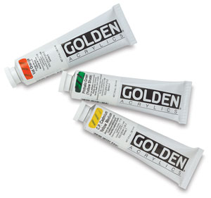
2.Acrylic Paints: Golden Artist Colors Heavy Body.
My long-term favorite brand of acrylic paint is Golden's Heavy Body acrylics. Golden is an American company created specifically to produce top-quality acrylic paints for artists. I love the range of vibrant colors, which includes an extremely useful set of neutral grays. The paint consistency is like smooth, soft butter, and it thins down for glazes easily, and dries rapidly. For serious impasto, you'll most likely want to add some medium (Golden produces a range of options, including gels and molding pastes)
Golden Heavy Body Artist Acrylics are known for their exceptionally smooth, thick, buttery consistency, and for their excellent permanency and lightfastness. These paints have the ability to "stand up" and retain brush strokes or palette knife marks on the canvas.
Heavy Body Artist Acrylics also contain the largest assortment of unique pure pigments in a 100% acrylic emulsion vehicle available to the professional artist. They contain no fillers, extenders, opacifiers, toners, or dyes.
Each Golden Heavy Body color is formulated differently depending upon the nature of the pigment. Colors that tolerate higher pigment loads dry to a more opaque, matte finish, while colors that are more reactive and do not accept high pigment loading dry to a glossy finish and tend to be more transparent. Since Heavy Body Acrylics contain no additives, such as matting agents, the gloss of each color will be different.
All Golden Heavy Body Acrylic colors are thixotropic in nature. This means that when brushing or stirring, the paints actually lose viscosity and feel much thinner. The faster the paints are moving, the thinner they feel. Returned to a state of rest, Golden Heavy Body Acrylic paints gradually increase in thickness until they are again restored to their formulated viscosity.
Golden Heavy Body Acrylics retain excellent flexibility when dry, greatly diminishing the possibility of cracking that occurs in other natural and synthetic polymer systems. They also can absorb the constant stress and strain placed on canvas when it is shipped, or as it expands and contracts with changes in temperature and humidity.

-Some colors contain pigments, such as cadmium salts, that are toxic, and should be used only by persons who are old enough to follow instructions for safe use and clean-up. Cautionary labels and warnings should be followed strictly. Do not apply toxic colors with an airbrush or sprayer.

(Golden Heavy Body Acrylics were the first products introduced by Golden Artist Colors, Inc., in 1980. Initially, the Heavy Body line was sold directly to artists in Manhattan in quart and gallon containers. Pints, 8 oz, and 4 oz jars soon followed, as the products gained more and more popularity with professional artists. Tubes of Golden Heavy Body Acrylics finally appeared on the market in 1990.
In 1980, it was considered unusual to contain a heavy body, high-viscosity paint in a jar. Almost all of the literature written about acrylic paints at that time implied that jar colors were thin, and tube colors were thicker.
Actually, the first waterborne acrylic paint was thin, similar in consistency to house paint. Only after technological improvements allowing for thicker paint formulations occurred could artist acrylics be sold in tubes.
Since Golden got its start by directly supplying professional artists, the company provided Heavy Body Acrylics in larger-size containers. As Golden products became widely accessible, jars and tubes provided more size and packaging options for a growing group of artists with a variety of needs.)


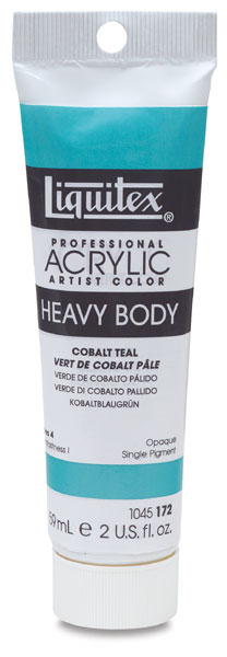
3.Acrylic Paints: Liquitex.
I like Liquitex's Heavy Body Professional Artist Colors for the paint's consistency (quite buttery and 'sticky', so great for using with a knife) and because they come in 'plastic' tubes which are incredibly robust. (To be technically accurate, Liquitex comes in Glaminate, tubes made from laminated layers of plastic, metal, and paper.)
Liquitex Heavy Body Artist Acrylic Colors (previously called High Viscosity) are professional-quality acrylics that have an exceptionally smooth, thick, buttery consistency, ideal for traditional art techniques that employ brushes and painting knives, as well as experimental, mixed-media, collage, and printmaking applications.
A high pigment load produces rich, brilliant, permanent color, combined with good surface drag that provides excellent handling and blending characteristics with increased open working time. When used for thick and impasto applications and techniques, Liquitex Heavy Body Acrylics retain crisp brushstrokes and knife marks.
Liquitex Heavy Body Acrylics remain flexible when dry, and thick films remain free of cracks and chips over time.


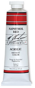
4.Acrylic Paints: M. Graham & Co.
If you wanted an acrylic paint with a long working time, them M. Graham & Co's would be top of your list (working in a hot, dry climate, they give me about half an hour). But as I'm an impatient painter and I work mostly in glazes which I want to dry quickly, I don't need to extra working time very often. The colors are sumptuous -- very strong and saturated -- and blend together beautifully. If you were used to working in oils and wanted to swap to acrylics, this would be the brand to try.

(Only pure, high solid resins are used, with no fillers, retarders, opacifiers, or bulking agents. Each pigment is present in the highest concentration possible consistent with good working properties. This gives each color outstanding tinting strength and mass tone.) 


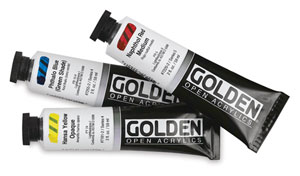
 5.Acrylic Paints: Golden's Open Acrylics.
Launched in mid-2008, Golden's Open Acrylics have an extended drying time, making them the most comparable to oil paints amongst all acrylic paints. Open Acrylics stay workable on a normal palette for hours rather than minutes, eliminating the need for a moisture-retaining palette. Open Acrylics provide the ease of using water as a medium (and for cleaning brushes) with a long working and blending time. The color range isn't as extensive as for Golden's Heavy Duty acrylics, but the fundamentals are included.

Golden Open Acrylics offer an escape from the studio, allowing acrylic artists to experience the warm sun and fresh spring breeze of plein air painting.
This is a professional line of colors and mediums formulated with a unique, relaxed set of working properties that stay wet longer, even in outdoor conditions. Their versatility allows artists to explore a wider range of techniques that rely on softening, shading, glazing, and creating fine detail.
Open Acrylics remain wet on the palette for extended periods of time. This means that color mixes are usable longer, resulting in less waste. Their remarkable working time makes them an ideal choice for many techniques, including plein air painting, portraiture, monoprinting, and screenprinting. They may be used with natural fiber brushes, and also work well with more traditional painting techniques.


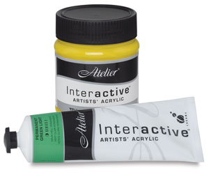
6.Acrylic Paints: Atelier Interactive.
The 'big deal' about these acrylic paints is that, according to the manufacturer, they "dry differently", that they don't form a skin as they dry so you can rehydrate them to keep working wet-in-wet by spraying some water on the paint or using a wet brush. I found I could indeed work back into the paint with a wet brush, which makes blending colors less of an urgency and easier. If you do a lot of blending of colors rather than glazing, consider this brand of acrylic.

Chroma Atelier Interactive Professional Artists' Acrylics are the world's only acrylic paints that can be used for conventional acrylic painting techniques, but when needed, artists can easily take advantage of their unique ability to rehydrate for blending techniques.
Chroma Atelier Interactive can be used for ordinary acrylic painting effects such as overpainting, scumbling, or glazing when used on its own — or for extraordinary wet-in-wet blending effects by simply using a water sprayer during a normal painting session. The next day — or days later — use Unlocking Formula to blend, reveal, or scratch back. The techniques and methods employed are readily accessible to beginners and professionals alike.
Atelier Interactive can be mixed with any other professional artist acrylic, but the paint will not rehydrate as when mixed with other Interactive colors.
Atelier Interactive is a world-class acrylic — archival and lightfast — with exceptional consistency, brushability, color load, and a satin finish. When purchased in 80 ml tubes, Interactive offers one-third more paint than standard 60 ml tubes — and it often costs less.
Whether creating a landscape, doing portrait/figurative work, creating a still life, or exploring abstract techniques, artists who use Atelier Interactive Professional Artists' Acrylics control the paint, instead of having the paint control them!

Conforms to California Proposition 65
CA Prop 65


 7.Acrylic Paints: Matisse Structure Formula.
Matisse structure paint is a 'normal' acrylic paint that does what you'd expect from a decent artist's quality acrylic. Probably the only unexpected thing about it is that it's made in Australia and has some unique color names (such as Southern Ocean Blue, or Australia Sky Blue). It has a soft, buttery consistency that will hold brushmarks if used undiluted, straight from the tube. It can be diluted with water and/or medium for painting without leaving brushmarks, for glazing, or for watercolor-type techniques. To increase the impasto effect, you'd mix it with impasto or texture medium.


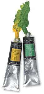
8.Acrylic Paints: Sennelier.
Sennelier are fast-drying acrylics with a consistency that's on the soft side of buttery. The colors are strong and saturated, mixing is easy before of the soft consistency of the paint. The paint spreads smoothly and easily on a canvas. If you like glazing and blending more than textures, I think Sennelier would be an excellent choice. 

Since 1887, the Sennelier name has been synonymous with quality, artist-driven innovation, and an unfailing commitment to the advancement of art. Now, Sennelier has turned its expertise, experience, and unerring eye for color to creating a line of artist-quality acrylics.
Sennelier Extra-Fine Acrylique Paints contain only the highest-quality pigments, selected to assure clarity, purity, opacity, and stability over time. A broad palette of 120 colors, most made from a single pigment, includes all the colors that made Sennelier’s Artists’ Oils famous, including traditional Ultramarines, Earths, Ochres, Cadmiums, Cobalts, and colors based on Quinacridone, Pyrrole, Naphthol, and Phtalocyanine. The line also features four interference and six iridescent colors.
Sennelier maintains a tradition of artisanal fabrication, subject to strict and constant quality control. Each stage of production is rigorously tested in the laboratory.
With a texture that duplicates the rich, creamy working properties of Sennelier Artists’ Oils, Sennelier Extra-Fine Acrylique are ideal for working with layers or wash drawings; in combination with other techniques such as pastels, charcoal, or ink; in overlays; and for creating collages and inlays. They can be used outdoor as well as in the studio, and adhere well to non-oily surfaces, including paper, canvas, cardboard canvas, wood, fabric, cement, plaster, and some plastics and metals.
They can be worked with a brush, painting knife, metal spatula, fingers, or directly from the tube to obtain thick lines. Their excellent spreading properties make them easy to mix, allowing for an infinite number of shades without altering luminosity. They are excellent for coatings and can be mixed with Sennelier mediums and retarders to modify their texture, viscosity, transparency, or luminosity. They are low-odor and dry rapidly to create a permanent, insoluble, non-cracking, non-yellowing, water-resistant film.


Conforms to California Proposition 65
CA Prop 65


9.Acrylic Paints: Daler-Rowney
As Daler-Rowney artist's quality paints (Cryla) are generally cheaper than Golden, Liquitex, or Winsor and Newton, I use them if I've got a large area to cover, especially in an underpainting. I've found some colors (e.g. Prussian blue) are a bit darker than other brands, which can be useful. The consistency of the paint is stiff to buttery. (Daler-Rowney's student acrylic range is branded System 3.)

 
 10. Acrylic Paints: Utrecht.
This is an American brand of paint which seems to be distributed only in the US. I first bought various tubes from a Utrecht store in New York because the price was competitive with more familiar brands. The paint is thickly buttery but spreads easily when diluted. The colors are what you'd expect from an artist's grade paint: saturated, with good tinting or covering strength depending on what color it is. While I wouldn't make a special trip to get hold of it, if it's one of the options at your local store, it's worth considering.


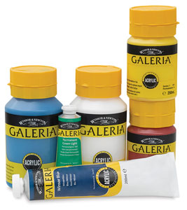
11.Acrylic Paints: Winsor & Newton Galeria Flow Formula.
While I'm a great believer in using quality artist's paints sometimes it's too inhibiting because you're worrying about wasting the paint. Then it's better to use a good student's quality paint that enables you to feel free to experiment, to just see what happens if you do something, to scrape off paint and paint over something. Winsor & Newton's Galeria brand is an affordable or student's grade of paint that has good strength in colors and works easily (though you'll have to add texture paste if you want thick paint as it's quite soft paint). And it doesn't put too huge a dent in your pocket.
Winsor & Newton Galeria Acrylic Color is a high-quality acrylic that delivers professional results, ideal for artists who want good-quality color at an affordable price. The 59 colors in the Galeria range offer a wide spectrum of pigment characteristics to choose from as well as excellent brilliance of color, strong brushstroke retention, clean color-mixing and high performance. Galeria has a smooth, free-flowing consistency, making it easy for the artist to use and mix, while maintaining its body and retaining brush marks.
They brush straight from the tube or pot, making them accessible to beginners. The adhesive qualities and quick drying nature of these acrylics, overpainting is possible within 20 minutes.
Use Galeria Acrylic Colors on many surfaces, including paper, canvas, degreased leather, fabrics, masonite, wood, brickwork, and plaster.
They are not recommended for use on shiny, glossy, greasy surfaces such as glass, unprimed metal, or surfaces painted with oil colors.
Galeria paints are formulated to be compatible with water, other Winsor & Newton acrylic colors, and Winsor & Newton Watercolor Mediums. All colors conform to the European Toy Safety Standard EN71/3.
When diluted, they are suitable for a wide variety of techniques, from stenciling, collage, sponging, and airbrushing, to painting on canvas. Colors are weather and water resistant once dry, making them ideal for use in sculpture and mural work.


Every artist will have their own preferred brand of acrylic paint, based on things such as the colors available and the consistency of the paint, which ranges from extremely buttery to fluid. Rather buy a few quality colors of artist's quality acrylics than a whole range of cheap colors. (Remember, student acrylic paints are cheaper for a reason: they've usually more filler in them, or made from cheaper pigments.) Here are my personal favorites from the brands I've used in paintings.

 Pictures and Description by
 Compiled by Shama.


 Brands List By:

Marion Boddy-Evans
Marion Boddy-Evans
Painting Guide.
Courtesy: www.about.com

painter Rick Stich

Unquenchable thirst for artistic inspiration

Water is the dominant fascination and artistic inspiration of painter Rick Stich


Lux artist Rick Stich's Water Mirror #1.

Rick Stich

Where: Lux Art Institute, 1550 S. El Camino Real, Encinitas
When: In residence through April 23; exhibit continues through May 18
Tickets: $10 (members, visitors under 21 and bicyclists admitted free; memberships start at $50)
Phone: (760) 436-6611
Online:
luxinstitute.org

Portrait of an artist

Personal: Born in Glendale in 1949. Currently lives in Santa Barbara with his wife of 35 years.
Affiliation: Santa Barbara City College
Education: Attended Orange Coast Community College in Costa Mesa and San Diego State University
Notable California exhibitions: Santa Barbara Contemporary Arts Forum, Santa Barbara Museum of Art, Carnegie Art Museum, Edward Cella Art + Architecture, L.A. Louver Gallery, and Ruth Schaffner Gallery
Corporate collectors: Bank of America, Eli Broad Foundation, and the Santa Barbara Museum of Art
Lux artist Rick Stich's Water Mirror #1.
Artist Rick Stich is inspired by water.
Lux artist Rick Stich's Water Mirror #1.
Lux artist Rick Stic's "Water Mirror #2," 2008.
Lux artist Rick Stich's Water Mirror #1.
Rick Stich’s “ Near left: Water Mirror #110,” 2007.
In the age of the short attention span, it is rare to find focus like that of painter Rick Stich, who has been painting the same subject — water — since 1981. Stich, who lives in Santa Barbara and teaches landscape and figurative drawing at Santa Barbara City College, is the current artist in residence at Lux Art Institute in Encinitas. Residents in Lux’s unique program spend a month creating new works of art in an exhibition space where the public can view past projects and interact with the working artist.
I met with Stich at Lux, where we were surrounded by his paintings, which are large and colorful renditions of the surface of water, and a site-specific installation he created for Lux. The installation comprises a dock, a pool of water, a small boat and light.
“The installation would be nothing without the light,” Stich said. While in residence, Stich is painting from the water in the installation. He is particularly interested in capturing the reflections of visitors looking in the pool.
Q: Are the paintings on exhibit drawn from memory or real life?
A: I draw to warm up, like an athlete warms up before a game. I make drawings to study the movement of water. The paintings are mostly from memory though. I’m a surfer. Riding a wave takes 10 seconds. The rest of the time I’m out there, I contemplate the movement of the water. In the studio, color becomes much more important. A work isn’t finished until both of those things are balanced and working together. I built a dock and small boat slip in this space so that people can see the source material and make connections between the paintings and the light, movement and patterns of water.
Q: I’m having a hard time deciding if your paintings are hyper-realistic or abstractions.
A: Good. I like it when they straddle the line between abstraction and realism. They may teeter one way or another, but that is a balance I try to keep.
Q: If you didn’t live on the coast of California, do you think you would paint something besides water?
A: I grew up on a beach in Southern California. That is what I know. Artists can only draw on what they know, and most of them return to memories of their childhood. This dock is a lot like the dock from my childhood. The color and shape of the wood are similar.
Q: What’s your favorite surf spot here in San Diego?
A: Swami’s and Pipes in Encinitas. We live in Encinitas every summer because Santa Barbara doesn’t get good waves in the summer.
Q: You’ve been painting the same thing in a similar way for a very long time. Do you anticipate your interactions with visitors here at Lux will change your process at all?
A: It already has changed. The other day, a teacher from the education building said a train of “tater tots” — that’s what she called the kids — were coming to show me their paintings of water. One little girl was dressed up like a pink princess, and her painting of water was also pink. Her piece excited me and made me want to paint in that color. All of the kids’ paintings were great. I asked them if I could have them, but they weren’t too keen on that.
Q: How do you teach someone to paint water, a notoriously difficult subject?
A: I grab a book and show students how other artists have depicted water. Then I tell them to try and find some movement. Start there. Draw that, and things will usually go well from there.
Q: Thirty years is a long time to study something. What keeps you interested, and do you envision a stopping point?
A: Have you ever found something precious? Or had the realization that you are looking at something rare? Water is everywhere; it is ordinary. Everybody has been in a boat or on a dock, and yet it is extremely precious. Water ties us all together. I can’t imagine an end to my contemplation of water. There is just too much to hold my interest.
Q: Did you know one of your paintings is for sale on eBay right now?
A: I can’t look at that stuff. I have a hard time even being at charity auctions where my work is for sale. It makes me feel like a cow at auction — I immediately say to myself, “I’ve got to get out of here!”
Q: What was the last book you read?
A: “The Wave: In Pursuit of the Rogues, Freaks and Giants of the Ocean.”
Q: Ha! It’s water-related … what a surprise. Do you have any hobbies besides surfing?
A: I lead a simple life. I spend time in the water, I teach, and I go to the studio.

Shawnee Barton is a San Diego artist and arts writer.
Courtesy.

Ai Weiwei's spot!

Ai Weiwei's New York: At the Asia Society, the Artist's '80s Photos Show How the Big Apple Shaped His Defiant Temperament


© Ai Wei Wei / Courtesy of Three Shadows Photography Art Centre and Chambers Fine Art
"Ai Weiwei, Williamsburg, Brooklyn," 1983, is among the self-portraits included in the Asia Society's exhibition of Ai Weiwei's New York photography.

By Andrew M. Goldstein

Published: July 1, 2011
NEW YORK— "I was a bit bored, very bored," Ai Weiwei told curator Stephanie Tung, talking about the period he lived in New York in the 1980s. Later in their conversation he added, "I don't really like to take photos that much actually."

Both of those statements begin to lose credibility after a tour of "Ai Weiwei: New York Photographs 1983-1993," a new exhibition at New York's Asia Society that reveals the mountainous heap of pictures that the Chinese artist and world-galvanizing political dissident took while living in the East Village. Ai led an interesting life indeed for the decade he took refuge in the Big Apple, and his photographs — by turns matter-of-fact and archly ironic — suggest an engaged budding artist who had no trouble keeping himself occupied.
Ai moved to New York when he was 24, and the early self-portraits here show him as a thin young man with a confident, up-to-something look in his eyes — a figure we get to watch morph over the course of the exhibition into the girthier and more hirsute artist we know, pursuing social causes with his camera. Much of the time he lived in the city he stayed on East 3rd Street, briefly attending Parsons while working such odd jobs as a street portraitist for tourists in Times Square, a extra in a Metropolitan Opera production of "Turandot," and a renown blackjack "guru" in Atlantic City. (Other gigs he worked include "renovation, construction, babysitting, cutting grass, [and] cleaning houses," he relates in the show's catalogue. "I liked them all.")


Ai also hosted a steady influx of fellow Chinese artists, who used his apartment as a way-station while reveling in the gritty freedom of New York City in the '80s. The expats in his circle included Tehching Hsieh, the performance artist who had come to notoriety by locking himself in a cage for a year in 1978 and spent the '80s doing other yearlong endurance pieces, including one where he tied himself to a woman with a rope. As the son of famous Chinese poet Ai Qing, Ai was also drawn to his neighborhood's literary counterculture, frequently hanging out with his East 12th Street neighbor Allen Ginsberg ("whose anti-establishment, anti-authoritarian stance clearly resonated with him," the catalogue helpfully notes). All the while he was taking photographs of everyone and everything, snapping thousands over the course of the decade.

Among the more compelling images in the show are the following: a nude self-portrait of Ai standing on a chair, with his genitals tucked between his legs, posing as a classical female garden statue; a photo of a wire hanger that Ai bent into the shape of a profile of a face — evoking Duchamp's cutout silhouettes — and filled with his now-signature sunflower seeds; another picture of Ai posting at MoMA with Duchamp's "To Be Looked at (from the Other Side of the Glass) with One Eye, Close to, for Almost an Hour" (the similarities between the two conceptual artists, who both sought artistic freedom in New York, are inescapable) and a series of Andy Warhol self-portraits; a shot of Ai posing with Ginsberg in a Chinese restaurant; images of Mott Street's famous Chinese New Year Festival; and pictures from the funeral, at St. Mark's Church, for Ginsberg's friend, the exemplary New York mystic scavenger Harry Smith.

But what has the most resonance — especially today, given Ai's recent and ongoing travails in China — are his photographic documents of social ills, from the era's AIDS epidemic to its ghettoized immigrant colonies to its rampant homelessness ("nothing had improved since Jacob Riis began photographing New York City slums in the 1880s," a catalogue author notes), and political subjects, like military pilots returning from the Gulf War and "Bill Clinton at His Last Campaign Stop in New York, 1992," as one photo is titled. The grand opus of this work is Ai's pictures from the Tompkins Square Park riots of 1989, during which he took pictures of the army of squatters facing off against heavily armed and thuggish policemen — pictures that he sold to the New York Times, the Post, the Daily News, and other newspapers. After the violence subsided, photographs of the riots were used in court to convict cops of police brutality.

Asked what drew him to take pictures of the event, Ai said, "I was interested in individual rights, group rights and their relation to power — power in the form of the police control — and the resulting confrontations and abuse of those rights." It was a prologue to his battles, in courtrooms and galleries both, with the Chinese government. Now that he is silenced by his yearlong probation, one hopes he still has recourse to his camera to capture and illuminate what he is seeing around him.

Courtesy of:Artinfo.

claudia ficca + davide luciano: potholes


'potholes' by claudia ficca, davide luciano
all images courtesy claudia ficca, davide luciano
(above) 'baywatch' on almafi drive, los angeles
image © claudia ficca, davide luciano


'potholes' by canadian creatives claudia ficca and davide luciano is a series of photographs
depicting the concave cracks as functional tools in a collection of imaginative tableus in the city.
captured within the backdrop of los angeles, montreal, and new york city, the set explores the urban
flaw as a playground, creating a multitude of uses out of them including a swimming pool, an oil tank
to fry doughnuts, a bath for pedicures, a giant plate of spaghetti, and more.

directly engaging with the street and the city, the highly imaginative series transforms the bad into good,
creating a tongue-in-cheek collection of tableus that are at once contextual and surreal. taking no more
than 10 minutes from start to finish, the photoshoots are done during uninterrupted traffic where there
is a suitable - and sizeable - pothole.


'alice in wonderland' on 30th street, new york city
image © claudia ficca, davide luciano


'fisherman' on henri-julien, montreal
image © claudia ficca, davide luciano


'diver' on avenue musset, montreal
image © claudia ficca, davide luciano


'gardener' on cote du vesinet, montreal
image © claudia ficca, davide luciano


'winemaking' on rue st.zotique, montreal
image © claudia ficca, davide luciano


'spaghetti & meatballs' on greenwich street, new york city
image © claudia ficca, davide luciano


'dog wash' on alfred street, los angeles
image © claudia ficca, davide luciano


'doughnuts' on rue belanger, montreal
image © claudia ficca, davide luciano


'beer & BBQ' on rue waverly, montreal
image © claudia ficca, davide luciano


'champagne' on tecumseth street, toronto
image © claudia ficca, davide luciano


'scuba diver' on avenue beaconsfield, montreal
image © claudia ficca, davide luciano


'laundry' on rue st.urbain, montreal
image © claudia ficca, davide luciano


'pedicure' on rue queen, montreal
image © claudia ficca, davide luciano


'baptism' on chemin de la foret, montreal
image © claudia ficca, davide luciano


'bubble bath' on rue de st.firmin, montreal
image © claudia ficca, davide luciano


'walk of fame' on new hampshire, los angeles
image © claudia ficca, davide luciano


'santa claus' on tremaine street, los angeles
image © claudia ficca, davide luciano

courtesy:DB

Followers

free counters